Bear with me; I am going to make a digression before the main part of this post.
In 1946, the most celebrated exponent of formalist black and white photography, Edward Weston, was diagnosed with Parkinson’s disease. Just two years later the 60 year old photographer ceased taking pictures altogether. However, during that two year period he took up colour photography seriously for the first time.
Weston’s late exploration of colour photography was the result of a promotional campaign by Eastman Kodak. The company commissioned Weston, and a number of other celebrated American photographers (Ansel Adams, Charles Sheeler and Paul Strand), to use Kodachrome transparency film. The resulting mages were used in advertisements.
Weston summarised his thoughts about colour photography (from making around 100 8×10 colour transparency images) in an article published in the December 1953 issue of Modern Photography. The short article, entitled ‘Color as form’, sets out Weston’s views:
“The prejudice many photographers have against colour photography comes from not thinking of colour as form. You can say things with colour that can’t be said in black and white…I never expected to take up color photography, though unconsciously I had been thinking about it. You don’t stop thinking about a thing because you don’t do it. As in black and white one learns to forget color, so in color one must learn to forget black and white forms… You find a few subjects that can be expressed in either color or black-and-white. But you find more that can be said through only one of them. Many I photographed would be meaningless in black-and-white; the separation of forms is possible only because of the juxtaposition of colors… Those who say that colour will eventually replace black and white are talking nonsense. The two do not compete with each other. They are different means to different ends.”
Having started my own photographic journey making large format images of the British countryside, I grew bored of the endless ‘greeness’ and drifted away from landscape. Following a 20 year distraction in the form of an academic career (which I have now left to concentrate on my photography), the last few years have seen an increasing commitment to b+w street/travel photography.
I like to think I have (slowly) learned to ‘see’ in b+w. By this I mean I look for strong formal compositions, think in terms of tonalities – high/low key, deep blacks, crisp whites, and contrasts between them – and value the abstract and graphic character of b+w photographs. I still have a lot to learn but feel I am making progress.
It’s come as a surprise lately to find colour images sneaking back into my camera when I thought I was out shooting b+w. To paraphrase Weston, ‘I never intended to take colour photographs, though unconsciously I must have been thinking about it’.
Three examples are shown below (all taken in summer 2014). I had initially processed the raw files as b+w images. However, every time I saw the originals in my catalogue the more impact their colours had on me.

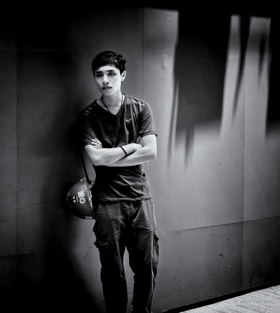
Construction worker. Hong Kong 2014
Your opinion may differ but, for me the colours above work well together and I think it makes for a stronger image. I’m not sure if it’s the relative proportions of red/green, their repetition on his hardhat or the fact the two seem blended in almost two-tone looking trousers (is that even possible according to Hering’s opponent process colour theory?). Perhaps it’s simply a psychological affect of the complementarity of red and green colours (trichromatic colour theory).
Here’s another example, less clear cut. I like both versions but prefer the colour. Here the colour blue in the water, shirt and basket adds something by stressing a connection between the women, the sea and physical labour. Oddly, this also involves a colour combination – blue/yellow -claimed to be antagonistic according to the ‘opponent process’ theory of colour.


Fisherwomen, Duy Hai Fishing Village. Vietnam 2014.
At the time each of these images was taken, I wasn’t consciously thinking about their colour. In fact, I was surprised at how effective the colour combinations were when I saw them later. They all work in b+w (for me) and I do recall specifically noticing the formal structure of the shots when I took them. Thinking in b+w I guess.
Here’s one more example below


Most photographers know that when you are out shooting and ‘in the zone’ you are often working sub-consciously, much the way driving becomes second nature (who hasn’t arrived home only to wonder how you got there?). Typically though, that relates to technique rather than vision. Most of the time we photographers are very consciously looking for images. On the occasions above, I was definitely thinking b+w images not colour.
I’m not really sure I like the idea of them sneaking up on me sub-consciously. Perhaps Weston had the explanation when he said:
“One does not think during creative work, any more than one thinks when driving a car. But one has a background of years – learning, unlearning, success, failure, dreaming, thinking, experience, all this – then the moment of creation, the focusing of all into the moment. So I can make ‘without thought,’ fifteen carefully considered negatives, one every fifteen minutes, given material with as many possibilities. But there is all the eyes have seen in this life to influence me.” – Edward Weston[1],
As you can tell, I’m still trying to make sense of how these colour images got into my camera. Maybe I should think less and just be grateful they chose mine.
[1] Sourced from : http://www.johnpaulcaponigro.com/blog/12034/23-quotes-by-photographer-edward-weston/
Words and Images © John Meehan
